
Remember the saying, “A picture is worth a thousand words?” It applies to data, too! Now, some may think I’m advocating that people stop using tools like excel, but that’s far from the truth. Excel is only the starting point! What I mean is that, if someone asks you a question about product sales or performance, giving them an excel spreadsheet or going through details of specific cases or transactions is not the right answer. In this era, it’s all about data visualization. This is not a fancy, smancy IT term, it means exactly what it says: presenting data in a visual way. And that’s why spreadsheets are dead: no one wants to see them anymore!
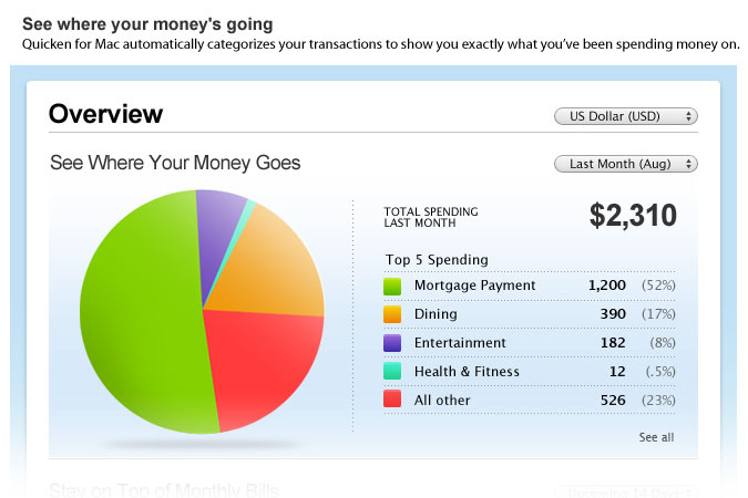
You see this type of presentation of data every day in bar charts, heat maps or bubble diagrams. Why not use it at work, in your sorority, for your wedding or at church? Step your data game up! The US Census bureau has a weekly publication on data visualization, found here. As always, if you need ideas, Pinterest is the place! The very best example is MINT, a tool that does all the work of organizing and categorizing your spending for you.
My other favorite way to present data is with an infographic (see example below from Mashable on the state of women-owned businesses, 2012). Infographics are graphic visual representations of data that are intended to present complex information quickly and clearly, The Next Web. If you want to see a few different options, take a look this Pinterest Infographic search on smart phones. You need not worry about using some fancy program or writing code to accomplish this. Find a design you like and mock it up in Power Point, or if you’re up for it, try this guide by Sarah Von Bargen.
Disclaimer: You definitely want to be careful about sharing your organization’s data and the tools you use. Check with your IT team and find out what tools are already approved, or influence them to adopt a new technology to support your needs.


